Tuesday, June 28, 2016

Axioms of Web Design

I was looking through the web looking for something that would catch my eye and make me want to find out more about. I stumbled upon a sub page of Swiss Airlines called World of Swiss that was something I haven't really seen before especially on an airline website.

First the design is beautiful. You can see right off that there is a left side and right side. the right side has quick shortcuts if you want to get to a certain point, or on the left you can scroll through and it will talk about everything you could want to know about their airline, from what it looks like inside the plane, to the people behind the scenes, or even the flight paths they take, at the end of the scroll is a live feed of flights that are currently underway which is really cool to see. 

The communication objective here is to be more transparent and let people see what they are actually all about, they don't have to explain anything except that they are an airline and can fly you around the world, but they take it to the next level. It is a great campaign to get people more interested in flying with them or maybe even taking a career with Swiss. 

The website is extremely intuitive and flows very well with the scrolls. You don't have to click on something and wait for it to load, it will fly past the things you don't want to see as if you are flying, it feels really smooth going through it.

Having red as their color makes the contrast great against the grey sky, it is easy to read what they have written and everything stands out where it needs to. Overall I think this is a great example of a web design that will keep people interested. I know I was stuck on it for 30 minutes just playing around with everything. I was actually surprised too how well it worked on mobile.

CLICK HERE TO CHECK IT OUT!!

Tuesday, June 14, 2016

Design Evaluation


This is a great example of packaging to me. They are simple yet it gives off a lot of energy with the lines in the colors. Almost an explosion which I am guessing they are trying to portray what it is like to have some of this coffee. Even with all the texture it still looks very smooth and creates a design and lots of shapes that is different to almost everyone that looks at it. The lines are almost leading to the bottom right where the type of coffee there is. There is similarity between the three packages, the main difference between them is the colors.  If you see all three of them you can easily tell that each package is different but they belong to the same company. This is a coffee that would stand out to me at the grocery store rather than a great value brand. I'm sure they taste the same but the packaging can make it stand out easier.


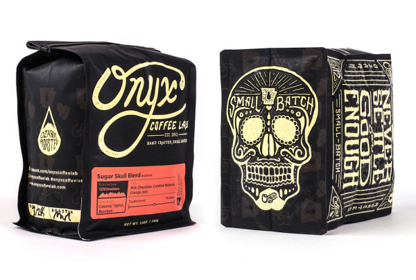
This is Onyx coffee. I think this is a bad example of packaging. There is not much continuity on any of this besides the color of the font. You have a lot of different sizes all over the package. It does have some symmetry on some sides of the package but every side is completely different and has no relationship to each other. There are a loot of different shapes and you can get some texture out of it that is nice. The contrast is great which makes reading the package easy, but overall I think it is a very busy design.


Wednesday, June 8, 2016

Contrast, Harmony, and Balance


This is an awesome picture I found online where a photographer left his exposure on for over 350 seconds to capture all of these lightning strikes. There is a lot of Gestalt principles in this photograph that make you think if he was thinking of all of these at the same time when he took the picture.

The first one I will talk about is similarity, I would partner up all of those lightning strikes coming from the sky, you can see the similarity in the color and texture of the lightning because it is not like anything else in the picture.

There is some closure in this picture with the horizontal line of the water to the sky, you can see that it breaks up a little bit where the railing and the two lighthouses are but you just think of it as going straight across when you see it for the first time.

The contrast on this is beautiful, without the lightning this is be the black of night with only the lighthouses being seen. But with this exposure you are able to see the white lightning light up the sky and even in the clouds you can see some of them lighting up ready so spit down some more lightning.

Even though there is a lot going on it feels peaceful just looking at this picture.

Wednesday, June 1, 2016

Visceral Response


I took this picture when I went on vacation to St. Kitts in the Caribbean. There is so much to this picture that I never really took the time to actually study it. So I thought I would do a little more analyzing on it.

First thing you will notice is the wall between the water and the town. The horizontal line is a sense of rest from the water to the city. It almost feels as if right before the picture everything actually stopped moving for the picture. I would feel extremely relaxed if I had a view like that to look at everyday.

There are plenty of shapes in this picture, there are rectangles from all of the buildings, windows, even the umbrellas. You can see form in the boat and the buildings at this angle. You can see different sides of them just from this straightforward angle.

The color in this picture is my favorite, you can see all these different buildings that have different colors give it a vibrant and upbeat feeling to it. Even though they are older buildings they still feel more alive than most homes you see in Utah. The water and sky give it a calm and cool feel with the blues and they are both filled with different values of blue which makes me feel more relaxed.

The negative space is in the water and there are two different positive spaces, the first one is the boat, which makes it feel like it is the only vessel in the sea. And the other positive space is the city. It makes me feel like it is a secret island that most people don’t know about because of the huge gap of water between me and it. Like it is a place you would want to go.

The texture is pretty vivid in the water, you can see from the shadows that it is a little windy and there are some waves here and there.