
This is a great example of packaging to me. They are simple yet it gives off a lot of energy with the lines in the colors. Almost an explosion which I am guessing they are trying to portray what it is like to have some of this coffee. Even with all the texture it still looks very smooth and creates a design and lots of shapes that is different to almost everyone that looks at it. The lines are almost leading to the bottom right where the type of coffee there is. There is similarity between the three packages, the main difference between them is the colors. If you see all three of them you can easily tell that each package is different but they belong to the same company. This is a coffee that would stand out to me at the grocery store rather than a great value brand. I'm sure they taste the same but the packaging can make it stand out easier.
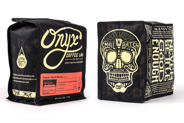
This is Onyx coffee. I think this is a bad example of packaging. There is not much continuity on any of this besides the color of the font. You have a lot of different sizes all over the package. It does have some symmetry on some sides of the package but every side is completely different and has no relationship to each other. There are a loot of different shapes and you can get some texture out of it that is nice. The contrast is great which makes reading the package easy, but overall I think it is a very busy design.
No comments:
Post a Comment